

Sean Michael Robinson:
Greetings!
Thank you to all the people who commented last week on their thoughts on the first 25 issues of Cerebus, the early fandom, and fandom in general. I found your responses to be very helpful in preparing the essay, which is now in need of some transitions and a second polish, but is otherwise in pretty good shape. Thanks also to those who emailed their responses.
With Going Home shipped and Cerebus in Hell? #0 digital "proofs" approved and the book on press, I'm doing mainly cleanup work this week, finishing up my essay for Volume One and taking care of various other tasks that have fallen by the wayside. Since things are a bit boring this week, I thought I'd write about something different.
I've written here, exhaustively, about scanning, about sharpening, about turning physical artwork into ones and zeros and then back into physical artwork again. But I've written very little about color. So with that in mind, and seeing how many of the people who chime in here are artists themselves, I thought I'd write about color a bit, in the least sexy way possible, as is my way.
TLDR: If you scan color artwork, you should be color calibrating your scanner.
TLDR: If you scan color artwork, you should be color calibrating your scanner.
Those of you who have been following along with the restoration work from the very beginning, now more than two years ago, might remember that, after taking some time off for a world busking tour, I'd been working as an illustrator and writer. When I first started talking to Dave about the print problems he was having, I had been living in San Diego less than a year, and most of my income was coming from freelance work I was doing, both locally and remotely. I had a long multi-month job with a startup tech company, making paintings and designs for a graphics-intensive app. Graphics for another training app for a different startup. Posters for shows—mostly music and theater, both in San Diego and for shows in my previous homes of Seattle and Orlando. Memorial portraits. Gift portraits. Odd jobs, truly odd, like producing artwork to be used in films, sometimes even in stages, so that an actor could "draw" my work on camera.
Anyway, although most of this work was produced for color in mind, the majority of it had an extra layer of digital assembly or color adjustment, using the digital as a way of working quicker despite my reliance on traditional media. After all, if you're producing work primarily for print or screen, it doesn't really matter if your "original" is in fact an assembly of half a dozen different pieces of paper and not one seamless whole.
But the past few months, I've been painting a lot more, and working in a more disciplined fashion, attempting to make the finished product solely on the art board or watercolor block versus relying on layering and adjustment to finish it off. And because of that, I've become a lot more picker about color.


This is a good example of digital assembly. I made the line art drawing and inking on one side of a thin piece of art board, then flipped it over and colored on the reverse using Higgins dyes, painting on my lightboard so I could see the lines through the paper. So this illustration doesn't really exist in the real world, only a strange two-sided original.

It's fortunate that, several months later, I don't remember exactly how long it took me to get the colors in the scan to remotely match the art board...
The scanner I'm currently working with is the finest flatbed scanner I've ever seen—the oversized Epson 10000XL, optically sharp and, with no lip and a removable lid, specially designed for being able to scan oversized artwork. It's the same scanner that both Sandeep and Gerhard are using for scanning Cerebus originals, and it's giving us great results for line art.
But as my painting's progressed I've been getting more irritated by the amount of time it takes to adjust my colors after the scan. And on a complex painting with lots of transparent overlays, it seemed like I would never quite get there.
So what's to be done about it?
Fortunately, there's a very easy solution—color profiling and calibration.
Imagine, if you will, the difference between accuracy and consistency. In this case, my scanner has relatively consistent scanning of color, at least over a period of a few months. It's just consistently off. Light reds and mid-tone yellows always seemed way too intense, blues subdued and muted, But because it's consistently off, if there was a way to recalibrate it...
No surprise, such a thing exists. Equally no surprise, it was developed for the needs of photographers, who happen to outnumber cartoonists by, oh, quite a bit.
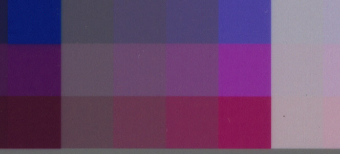
What we're looking for is called an IT8 target. You scan this target in your professional scanning software (i,e, either Vuescan or Silverlight) and reference the file supplied with the target, and voila! all color adjustment woes are gone, at least for a few months. (The standard recommendation seems to be to recalibrate every few months, unless you're doing extremely critical color work or are working on an ailing scanner. Fortunately, using the same target is just fine, as long as you haven't been storing it in the sun!)
Being the frugal person that I am, I purchased my IT 8.7 target from German color obsessive Wolf Faust, who manufactures them himself and ships him out of his home in Germany. All told I paid $20 for a single target, less than 10 percent what I would have spent purchasing one from another source. The package arrived a few days later. Fifteen minutes of following instructions later, and I was done!
It's an amazingly simple concept. The package contains the target, a specially-prepared print on photo paper, representing a full range of values and tones. It also includes a data file that acts as calibration, listing the expected values. Once the calibration scan has been made, Vuescan can reference the supplied file and make adjustments to the actual results to correct for the result that had been anticipated. In other words, changing consistency to accuracy.


It's an amazingly simple concept. The package contains the target, a specially-prepared print on photo paper, representing a full range of values and tones. It also includes a data file that acts as calibration, listing the expected values. Once the calibration scan has been made, Vuescan can reference the supplied file and make adjustments to the actual results to correct for the result that had been anticipated. In other words, changing consistency to accuracy.


This is the illustration that finally motivated me to get the color calibration sorted out. I started the whole painting with various intensities of yellow, resulting in "hot" foliage and "cool" foliage for the different types of plants. The over-intensity in yellow of the original scans were making the hot foliage appear to be way too hot, sunburnt, while the cool foliage looked sickly, nothing at all like the original artwork. The above is a raw scan with only a levels adjustment.
The new norm has been — power on the scanner, open up Vuescan, make sure my settings are still loaded, and scan that sucker. 90 percent of the time the raw scan now only needs a levels adjustment to make me happy.
This too can be yours, for $20 US and a little bit of patience!
Step One-
Step Two-
Step Three-
Step Four-
Make sure you are consistent your color spaces! Vuescan and Photoshop should be operating in the exact same color space for best results. I'd recommend AdobeRGB.
Make sure you are consistent your color spaces! Vuescan and Photoshop should be operating in the exact same color space for best results. I'd recommend AdobeRGB.
Step Five-
Paint, scan, enjoy!
Questions? Hit me up in the comments!


3 comments:
Your artwork has really improved, I am quite impressed. Very lively but not sloppy, good balance, fresh inking. One thing about color scanning/prepress … the targets are a great idea but relying upon the harmonized calibration of scanner/screen is going to drive you nuts, it's very unstable. Not only in the software/hardware department but in the perceptual department, that is to say, your own perecption of color changes constantly. And the pressman. And the reader. In fact, that is the Jedi secret of color correction: no two sets of eyes see the same thing at the same time. And no single set of eyes sees the same thing over time.
After you scan, check the CMYK numbers of the art in PS because that is what the press is going to spit out, not what you see on screen. In other words, learn to read the numbers (as they translate into offset) and adjust the colors as a holistic unit to work with the repro method
Your safest bet is relying on the actual numbers of the colorbuild, not the colors on the screen. Judicious color correction after a target-controlled scan, relying on the numbers, is the way to go. And use an appropriate CMYK profile for final output. Manipulate curves, not levels, avoid making selections and watch the numbers like a hawk.
Good luck! Mahendra
I know people who swear by the Datacolor Spyder for colour calibration.
-- Damian
Hello Damian,
Yes, color calibrating your monitor is a neccessity for making sure any other choices you make are correct. But calibrating your input device, in this case the scanner, is a way to reduce back-end work as well, and is especially critical when the person doing the adjustment is not the same person (or in the location with) the person scanning the original artwork :)
Post a Comment