
(100 Hours Internet Tour at Newsarama, February 2008)
I'm not sure if I can take credit for the trade paperback format.
That takes in a lot of territory. You could probably make a persuasive
argument that Joe Quesada and Paul Levitz, individually, at some point,
looked at a CEREBUS trade and thought, "Okay, we can do much bigger
volume than he can, so the cost per unit comes way down, presumably" and
got Quebecor to price the "phone book" format. As far as I know Marvel
was first into the pool with their "Essentials". Even taking into
account that I had been doing it for ten years at that point, it still
represents pretty innovative thinking (i.e. "We don't print in black and
white: as far as we know our fans only buy colour...but is that, in
fact, true?").
As these things tend to work, competition benefits everyone. You
can say Marvel and DC "stole" my idea, but in doing so, they also broke
down the barrier between colour and black-and-white and trade paperback
vs. phone book. Their customers are, now, already familiar with what I'm
doing whereas before they had no frame of reference for it.
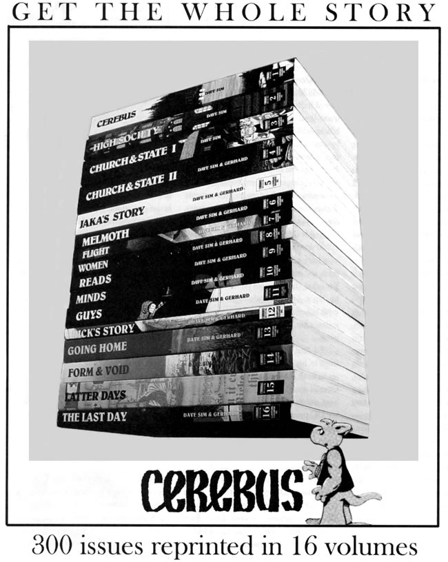
If I had a lick of common sense I'd call HIGH SOCIETY "THE
ESSENTIAL CEREBUS Vol.2" instead. Oh well, I'm not really known for
common sense a lot of times.
2 comments:
I always wished the last four volumes had black and white covers.
Dave can say what he wants about the Marvel Essential reprints, but I still contend that I cannot stand to look at them. Pencils and inks made to be colored (as in most of the rest of Marvel's and DC's books) do NOT translate well to being printed in just B&W. To me, they come out muddy and unappealing. Dave and Ger drew and inked their art to be printed in B&W originally and, as such, they are nearly always crisp and clean, even in the phone book reprints. Just sayin'.
Post a Comment