
DAVE SIM:
(from Weekly Update #33: Square One, 30 May 2014)
"Sean... you should have been sent an unbound copy of CEREBUS some time ago. Lebonfon, based on my own assessment of a year ago, makes the point that there are far fewer pages that need to be corrected on the CEREBUS volume than on the HIGH SOCIETY volume. So, one of the things that I'd like to hear from you is: do you think that's the case? Looking at the book as a fan of the cartooning on CEREBUS, as a fellow artist and someone already familiar with the book: as a fan of CEREBUS itself. I'm recommending a head-to-head comparison, going page by page with your own copy of the CEREBUS trade or with CEREBUS back issues or both..."
 |
| Montana Landscape by Sean Michael Robinson |
Well, I got the unbound Cerebus trade via FedEX on Monday, and spent many hours with it Monday and Tuesday.
Let me get the get to the take-away first -- I think you should go ahead and sell it as-is.
Before I start in here, let me define the terms, as on the last few back-and forths with George, things were getting a bit confused.
Bitmap-- a black and white, binary digital file (1-bit file). As the name bit suggests, every piece of information (pixel) is either on or off, black or white. This is as opposed to a grayscale file, which contains gradated information for each pixel.
Continuous tone-- any image, such as a photograph, that contains gradations of value, with some areas of tone being lighter or darker than others.
Raster-- an image file that contains pixel-specific information; this is as opposed to vector information, which exists as a drawing instruction rather than points in space. Any photograph or drawing will be represented digitally by a raster image.
RIP (Raster Image Processor)-- the workstation (or stand-alone piece of hardware) that converts supplied grayscale raster files into bitmap files appropriate for the platesetter.
Platesetter-- the machine that creates printing plates for an offset press.
Okay. So the biggest surprise for me when I opened the package was this -- even though George supplied grayscale files for the entire book, the majority of the pages were successfully converted to bitmap by the printer prior to printing. Every page that was sourced from the film negatives looks the same as it would have if George had just converted his grayscale files to bitmap himself prior to submitting the pages.
I have no way of knowing whether this was just really effective RIP settings/processing or whether Lebonfon has a really conscientious prepress person who was working on the job, but this essentially means that the majority of the book looks pretty good. (That was my mantra for a good five minutes, flipping through it. "Pretty good, pretty good.") There are other problems, but those are minor compared to the disaster that COULD have been here.
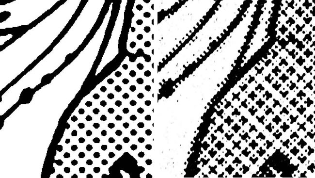 |
Left: Cerebus no moire-- a close-up of a portion of a Cerebus head and background
figure from page 23,
created by taking George's grayscale file and
bit-map converting it so as to avoid half-toning.
The half-toning has created moire in the Cerebus tone, visible by the odd shapes the dots have turned into. |
Some of you following along with the "bitmap or grayscale" cage match might be surprised to find that all grayscale files are converted to bitmap prior to creating a printing plate. That's because the printing plate doesn't DO gradation -- it only does on or off, i.e. binary. Either inked surface, or not inked surface. So when you supply a grayscale file for print, the RIP (and prepress operator) are making decisions about how best to convert. In the case of line-art, the person preparing the book is hopefully submitting them as bitmaps in the first place, avoiding the possibility of them accidentally being half-toned. In the case of continuous-tone images, like photographs, the images are half-toned, i.e. using dots to create the illusion of gray scale, using one of two common processes.
As a person who's had their line art illustrations half-toned against my will, I can tell you, it's not a pleasant experience to have your lines transform into dots.
BUT! That hasn't happened here for all of the pages that were sourced from the negatives. They all look exactly as if George had converted to bitmap before submission, despite their outer-edge gray pixels.
Which leaves the problem pages.
The real problem pages are, strangely enough, the ones that were sourced from scans of the original artwork. This is because these have been treated by George as continuous-tone images, rather than line art. By not contrast-adjusting the pages, he's preserved pencil marks, smudges, lettering guide lines, incomplete black ink coverage, incomplete white ink coverage, and other "details" of this nature.
This might be interesting in color, where the effect might create more of an illusion of texture of the original page, but for the most part, it's an oddity and a distraction here. It's also why the majority of these pages have moire on the Cerebus tone. One screen (Cerebus tone) through another screen (half-tone) = moire.
There are exceptions to this. I enjoyed a few of the Sump Thing pages w/ splatter and white ink, as it gave me a bit of a peek into the process of the drawing. But this was enjoyment as a cartoonist, not as a reader. I have to think that a reader would mostly wonder, "Why is this happening here? Why is he all fuzzy? And why did that only happen for a single page?" This approach might be great for an art book, in color, but it's awkward as a reading experience. Part of the whole charm of cartooning is that lineart, treated as line art, looks like text! There's a unity to the text elements and the line elements, like words and pictures are somehow the same thing, made of the same stuff. All of that goes away when you start to treat it like it's, I dunno, a photograph of a line art event.
That being said, despite the moire, which is inevitable given the nature of the files supplied, the half-toning actually looks really good! (You know, for half-toning). A really fine screen as well. I don't know if I've ever examined frequency modulated half-toning, which is what's happening here. It does a really great job of hiding from the eye, especially compared to the old stand-by process, now referred to as amplitude modulation. (The old process used fixed position dots of varying size. This new technique uses fixed sized dots that can move in position and amount.)
Own photoshop and what to play along at home? Open up any high-res grayscale document in PS.
For non-halftoning bitmap conversion, go to image → mode → bitmap, then select "50 % threshold"
For AM halftone, go to image → mode → bitmap, then select "halftone screen"
For FM halftone, go to image → mode → bitmap, then select "diffusion dither"
Anyway.
So. The other, comparatively minor, problems--
I'd say the Cerebus tone, and the overall cast of every page, has been way too aggressively lightened on maybe half the pages total. I've marked it in my copy, but really, there's no point in making a list—it's happening all over the place. Strangely enough, the tone is usually the right density on the pages worked on from original art, despite the moire -- presumably because George has done less density-adjustment on these.
The lightening has helped the duotone issue though -- I'd say that one has never looked better! The muddiness has mostly receded.
There's quite a bit of lightening of dense cross-hatching as well. I was confused before when I was talking to George about bitmap conversion and he kept on talking about "losing detail" in the dark areas. I now see what it is he was talking about, essentially, he seems to be lightening areas of dense cross-hatching so as to reduce fill-in and enlarge the space created between the hatched lines.
But to me, this sometimes changes the balance of the page, and diminishes the difference between solid black areas and the almost-solid black areas. You created these pages larger than the printed size, and then reduced them down. There will inevitably be some fill-in in dense cross-hatching. I don't think it does the artwork any favors to lighten all of this fill-in out of existence. (The exception being the early issues, which look pretty horrid and ink-clogged in the trades. These mostly benefit from the aggressive lightening.)
The pages overall are much lighter than originally, suggesting a need for much, much more one-off proofing while in process to insure the pages maintain the same balance as the originals.
 |
Left: Resolution A-- a close-up of an area on page 97, from my 1994 era phone book, showing some smaller lines.
Right:
Resolution B-- a close-up of that same area in the new printing,
showing broken lines.
These are the effective limitations of 600 ppi.
|
The other problem is one of resolution of the source scans. The negatives I've seen have been scanned at 600 dpi, which is much too coarse to catch the finer lines. This problem starts at page 97, during the rain scene, and continues intermittently throughout the book, depending on how fine the lines were in the original pages.
(We also know now what will happen to teeny tiny tone at this low resolution. Take a look at the fine tone on page 240, bottom right panel. The fine tone has completely disappeared in this printing)
(We also know now what will happen to teeny tiny tone at this low resolution. Take a look at the fine tone on page 240, bottom right panel. The fine tone has completely disappeared in this printing)
The only problem I really perceive with the actual printing is just the flatness of the black. I don't know if it's the ink density or the paper selection or what, but I would think that somewhere there's a better combination that would produce darker blacks.
All of these caveats aside, I think this book should probably go ahead as-is.
For a casual reader, these problems might be mild distractions, and they contribute to the already hodge-podge nature of the book. But I don't think any of them really warrant pulping the whole thing, at least, not if things are adjusted the next time the book comes up for print.
And for the non-casual reader, the inserted half-tone pages might be an interesting diversion from material they're already familiar with, even if they do exhibit moire.
There are books that come out all the time with more disastrous treatments. I'm thinking of Dororo, which came out from Vertical in 2008 or so. An entire book of fine line-art, perfectly prepped and adjusted, but then printed through a ridiculously coarse half-tone screen. Someone at the printer checked the wrong button on a dialogue box, and suddenly the whole book is a mess. Of course, they still sold it as-is. (They might not have if the rights holder had gotten a look at a copy beforehand...)
If you wanted to sweeten the pot a bit more, you could sign every book.
But if you were interested in replacing just a single signature or two, there are some choices.
These are the pages that I consider the worst, from a moire caused by half-tone standpoint--
13, 14, 18, 22, 23, 27, 39, 44, 120-128, 129, 130, 132-140, 296-303, 367, 417, 431, 435, 485, 522, 537
So if you're replacing single signatures, that suggests these--
Signature 1-32 would eliminate 6 problem pages
Signature 97-128 would eliminate 10 problem pages
Signature 129-160 would eliminate 10 problem pages
Signature 289-320 would eliminate 8 problem pages
But, as I said, I think this will be an imperfect book either way, but not necessarily in a way that makes it unreadable. I think it might be a better strategy to just sell it and put then it on the back-burner for now, focus on the High Society rescue mission. That would at least break the jog-jam a bit, and buy some time for the next step.
I still think my suggested outline for action from two weeks ago is the right way forward. No manipulation, except where it's needed. Extremely high-res grayscale scans of the negative, where available, or of printed books, when the negative doesn't exist anymore. 2400 dpi. It's the resolution limitation of the platesetting process for many platesetters -- why not exploit it to the fullest? 600 dpi is woefully inadequate, even on this early material. And, most importantly, treating line art as line art. No futzing, no fussing, just a clean transfer.
Anyway, it's time to wrap this up. It was a good call sending me the book. Congrats again on the successful campaign! (I sent John a quick note/question re: the formatting for the portfolio. Let me know what you guys decide and I can make a few final suggestions/adjustments to the files before printing, namely, a little bit of sharpening.)
Best,
Sean
Sean Michael Robinson can be found online at Living The Line.
6 comments:
Dave,
I chimed in on this discussion only once before it quickly became too technical for me to follow. My advice is the same then as it is now; accept the flaws, move forward. I say this without any knowledge of printing or any special perspective on business or publishing. In my own personally ignorant position as a fan, I think that this problem is killing your business and eating up an absolutely gross amount of time that could be more constructively spent. Sell the book as is.
Looks like someone's waxing up a crop of dental floss in Sean's landscape. Yippee-ai-yo-ti-yay! ;)
In more serious mode, this sounds like good news, if Dave does decide to go ahead with a new printing of v.1 from here. With that in print and the IDW High Society DVD set, people will be able to get the entirety of the series (well, sans the Zero issue stuff...), maybe even by the end of the year.
That's the kind of good news that makes me want to throw a baby! ;)
I just got an email from George expressing surprise that I would suggest selling these as-is, and I can see why, since I come across as someone really focused on minutia, that might be surprising to some people.
If I thought this would be the last time this book would be in print, the legacy printing, if you will, and that no other editions would ever come out, I'd say go ahead and pulp it and start over. But seeing that most of these printing problems won't be encumbrances to the average reader, and seeing this in the context of your larger business and the other books being unsellable without the first being available... then I'd say selling it seems more reasonable. It's in this context that it makes sense.
If this were the first time the material were appearing, and possibly the last, I'd say take it on the chin and head back into another round. But that's not the context we're in here.
Just wanted to be clear where my endorsement here is coming from.
Sean,
Sounds like a logical and pragmatic solution.
Michael
It's been fascinating reading all the printing posts, a subject that previously held little interest. Along with myself, i suspect there will be be many others who will buy the book primarily as a printing review exercise, particularly since they'll already have a copy. Now if only it was hardback...
There is no way I would buy this version based on the examples shown especially since, as Tim P mentioned, I already have one. I would pay the bill and start over with 2400 dpi scans. I guess Dave could sign them and sell them as some sort of novelty to at least generate more cash flow, but my understanding was that he wanted a complete restoration to the best version possible so he would be done with it once and for all and have the FINAL version to be used in all future printings.
Now that I think about it... I guess it could be used in future Kickstare campaigns. A unique unbound phone book signed by Dave. I think I might pass on that one.
Post a Comment