Dave's calling on Thursday, but we're NOT doing Please Hold. Since the only question anybody is gonna send in is "What the hell happened on The Strange Death of Alex Raymond?" we're doing a little something I like to call The Bizarre Autopsy of The Strange Death of Alex Raymond: What Went Wrong, AND HOW!
Heritage has the cover for issue #30, and some glamourpuss art too, NEW ADDITION: Strange Death of Alex Raymond preliminary sketches by Dave.
And the buttons go bye-bye: The Red State Button and The Blue State Button
________________________________________________________
Here's some fun for Everybody:
 |
| Mail there, or just Fax: 519 576 0955. Or email me at momentofcerebus@gmail.com and I'll take care of it. |
So, got a Fax from Dave:

Dave Sim is the creator of Cerebus the Aardvark, which ran for three hundred issues from December 1977 to March 2004 (and is available digitally here.) His latest project is the ongoing Cerebus in Hell? (Daily strips are posted here, and the next #1 is Attractive Cousins (available at the end of July), Batvark PENIS! or the "Censored for Grandma" variant: Batvark XXXXX! are currently available for order from your local Comic Book Store. And if you want a copy of Vark Wars: Walt's Empire Strikes Back signed by Dave & Me, details at the link.) And every Friday he posts a video "update".
Dave also sent the original fax from Mr. Klein:
Did ya catch that bit at the end of Dave's fax to me?
Yeah, I had to forward the fax to Mr. Klein. I said:
Hello Mr. Klein, sir,
I'm Matt Dow, the Interim Editor at A Moment of Cerebus, http://momentofcerebus.blogspot.com/ .
Dave Sim has asked me to relay a fax to you (attached.)
As you can see, he's hoping to run a dialogue between the two of you on AMOC. If you're amicable, I would need a short biographical description of you, and a photo you would want me to run.
Thank you,
Matt Dow
And Mr. Klein wrote back:
Hi Matt,I thought I would type out Dave’s faxed comments and insert comments of my own, I hope that will work for you.Hi Todd! Thanks for including me in your book. I don’t get included a lot of places anymore. I realize your time is at a premium, so we’ll try and keep our back-and-forth “short and sweet.”Thanks, Dave. I’m a long-time admirer of your lettering on Cerebus. My book is titled “The Art and History of Lettering Comics,” from Abrams Comicarts, and is expected to be released in the fall of 2021. I can’t imagine a book on this subject without a few examples of your fine lettering, but it’s a large topic and my space is limited. I’m very interested to see examples from your fans that they feel are your best lettered pages, let’s say two or three per person. Hopefully we can come to a consensus from those examples over the next few weeks.There are many interesting idiosyncrasies for different letterers and cartoonist letterers. One of the most interesting for me is Winsor McCay, who was probably the most meticulous cartoonist in terms of compositional consistency and detail. But when it came to his lettering, he had this weird habit of underestimating how much space he needed for the words in a caption or word balloon and would end up just lettering the end of the caption or spoken text up the side of the caption or balloon. His OCD detail just seemed to stop where the illustration stopped and switched to “close enough for government work" on his lettering.Dave, I have long thought much the same. My theory is that, like some artists I’ve worked with, he wanted the lettering and the enclosing balloon and caption shapes to take as little space as possible to leave as much of the page for art as possible. Not only is his lettering very small proportionally to the art, it’s usually very narrow and condensed. The balloon shapes seem to be drawn as close to the letters as he could get them. Of course, you have to remember that McCay’s original art was very large, much larger than comics art today, so as he saw the lettering it may have looked fine. While McCay often seemed to begrudge space for lettering, there were a few among his many comic strips where it instead became the focus of the story. I’ve featured those in my book.Something I noticed in the latest issue of COMICS REVUE (nice logo you did for them, by the way) is that Milt Caniff, if he had three connected word balloons for a character would still have a balloon tail on all three balloons. I think he was the only guy to do this. All the rest of us are thinking, well, if the three balloons are connected, it’s implied that only one balloon tail is needed. Basic visual grammar. But not Milt Caniff.One thing readers will learn from my book is that from 1936 to 1977 all the lettering on Milt Caniff’s strips TERRY AND THE PIRATES and STEVE CANYON was done by Milt’s friend and studio-mate Frank Engli. Some of the styles that became standard in the 1940s and later, including the use of a wedge-tipped pen to create a thick and thin variation in the letters, and the styles of word balloon and thought balloon shapes, came from Engli. He is practically unknown and under-appreciated, something I hope to address. Engli was also a good artist and produced a few short-lived strips on his own like ROCKY THE STONE-AGE KID in the early 1940s that are worth seeking out. As to having multiple tails in connected balloons, I hadn’t noticed that one! As you say, most letterers don’t follow that idea, usually, including me.I used to argue with Will Eisner who maintained that you can’t break up a sentence over multiple word balloons. To me, that was method-acting. If someone pauses in the middle of a sentence or has a half-beat between words, that implies uncertainty, hesitancy that’s barely perceptible. And you have to decide how far apart the balloons are, implying the length of the pause.I agree with you on all this, though like many things it can be overdone. One convention of comics lettering some writers don’t understand is the difference between a double-dash and an ellipsis (three dots), which I feel represent two different kinds of pauses in speech. The double-dash (which came from old typewritten scripts as the only way to show a long or em-dash) suggests an interruption in speech caused by shock and surprise, something that happens to the speaker, or a sudden change of thought. An ellipsis is a longer pause created by the speaker talking slowly, stopping to think or choose his words carefully. It’s the difference between:“What? No--I didn’t kill him!” and “I never drink…wine.”Any eccentricities come to you top of mind having studied everyone so closely for your book?Every letterer starts out trying his best to conform to a standard style he admires or has been told to emulate, and every letterer worth his salt eventually develops a personal style that differs from that model. It’s part of the process. It’s hard to give examples without showing visuals, but you’ll find them throughout my book. Today’s digital lettering side-steps a lot of that, as many letterers are using the same exact fonts, and their work is less distinctive, but among hand-letterers, every one has unique style points.Matt, attached are a recent photo and brief bio which you can cut as needed. Please send me a link when this goes online. Thanks.Todd
 |
| THE Todd Klein |
Todd Klein’s comics career began in 1977 when he was hired to work in the DC Comics production department. During ten years on staff there, Todd tried many kinds of freelance work including writing (TALES OF THE GREEN LANTERN CORPS, THE OMEGA MEN), inking and coloring, but found lettering suited him best, and developed a freelance career as a letterer and logo designer. Todd learned from and was inspired by the work of Gaspar Saladino, John Workman, John Costanza, Tom Orzechowski, and other letterers then working in comics. After leaving staff in 1987, Todd continued to work mainly for DC, but also for Marvel, Dark Horse, Disney, Gladstone, Image and many other companies, doing lettering and logo designs. Through the years he’s lettered over 65,000 comics pages and covers and designed over 800 logos. Todd has been presented with 16 Eisner Awards for Best Lettering, as well as 8 Harvey Awards and other honors. Recent projects include SANDMAN OVERTURE with Neil Gaiman and J.H. Williams III, STARSTRUCK with Elaine Lee and Michael Wm. Kaluta, THE LEAGUE OF EXTRAORDINARY GENTLEMEN with Alan Moore and Kevin O’Neill, and many other projects for Vertigo/DC Comics. You can learn more at his website: kleinletters.com.
______________________________________________________________
Now, before EVERYBODY starts shouting their "picks" of the TWO or (possibly, if necessary,) three "best" pages of Dave's lettering. As the Head Honcho Man I get to put my two cents out there first:
If it were ME, and ONLY ME picking, and I only had TWO (or if absolutely necessary, but try to reign it in a bit) three pages to work with, I'd choose as my #1 pick:
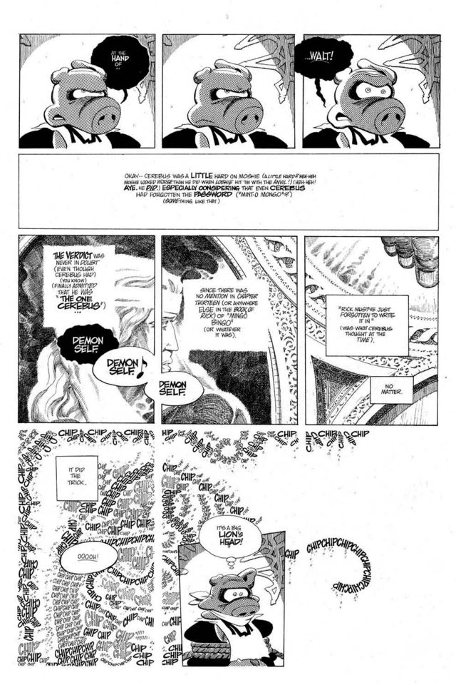 |
| Page 106 of Latter Days. |
I mean, that was the first page that popped into my head when I read Dave's fax.
(It's a hard choice. We're talking about 6000+ pages of art. If you were to lay out all 300 issues, and turn on a fan and let it blow them open randomly, then threw a dart, the odds are pretty good you'd hit a panel with some amazing lettering.)
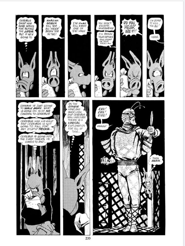
And then a montage of balloons from various pages that show off Dave's lettering abilities. Stuff like:

But, those are pages where the lettering is just a PART of the overall page design. The lettering SERVES the story (as it should). How about three pages that are ALL lettering, and the lettering TELLS the story?
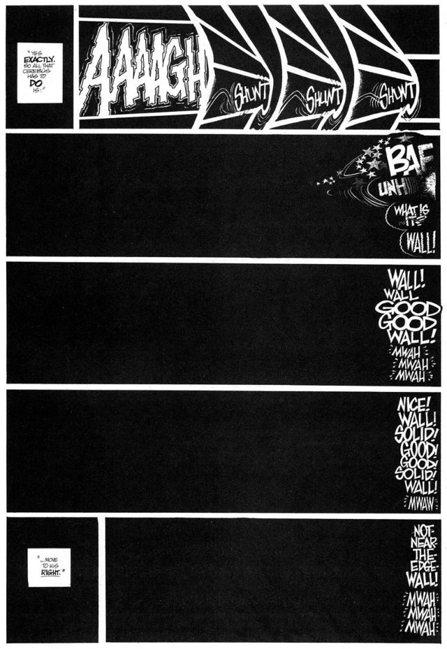
Like these three pages from Latter Days:
 |
| Page 153 |
This is from an eighteen page sequence that's (mostly) just black panels with lettering. And the lettering does ALL the heavy lifting...
OR or: I'd just run these two images:
 |
| Will Eisner's A Contract With God |
 |
| Dave and Ger's tribute to Will. |
I recently re-read A Contract With God, and when I got to Will's page, I thought, "Gee, I remember this being more melodramatic..." Turns out I was mentally picturing Dave and Ger's version. I mean, it's full blown "William Shatner as Captain Kirk playing-to-the-cheap-seats" melodrama (I saw a documentary where Shatner talked about his theatrical training, and his Kirk makes a lot more sense if you picture him performing on stage at a crowded theater.), but still really effective.
Okay, NOW you guys can go nuts in the comments... (And REMEMBER: TWO or (possibly, if you ABSOLUTELY can't keep it that limited,) three pages.)
Next Time: Hobbs. Cerebus. Hell?


