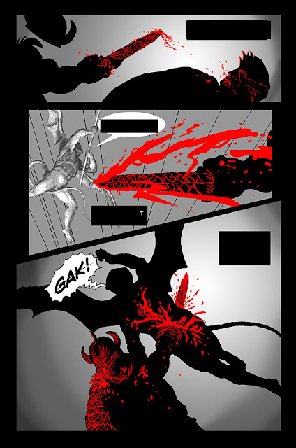
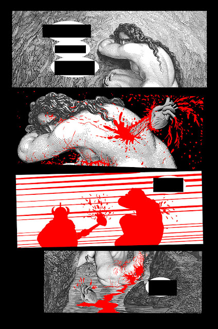
Here are two pages from a possible upcoming CIH? issue. I was exploring a different layout and style on these. Let me know what you think in the comments!
Update: I posted a set SPAWN 10 DISTRESSED EC style covers on eBay!
Next Week: Something to do with SWORDS of CIH?!


6 comments:
I, for one, would be happy to read something in portrait-layout rather than landscape.
Sort of a "Sin City" approach?
That’s the vibe I get too from looking at those pages, Jeff.
Dan E- I'm always delighted when there are portrait pages in CIH?. Amicable Spider Vark might have been the last time we saw that. Or Hermann? I think an entire book in portrait would be fun.
Jeff and Brian- It started as a riff on BRSRKR, but definitely picked up some SIN CITY vibes with that limited color palette.
Would this be the first CIH? with color?
Not including the Inside Covers, this would be the first time CIH? was in color. We looked into the cost of adding just red for a previous issue, and it does raise the price to print. I'm not sure how that effects the cover price, but I assume it raises it. We didn't print the previous issue with red, although I can't recall if that was an creative or financial decision. We'll have to see how practical printing this book is. Currently, we're waiting on Dave to comment. (The pages were sent to him via snail mail.)
Post a Comment